Color block: strong or pastel tones
The use of color blocks to compose environments returns to the spotlight. Contrary to what many people think, the color matching to form the color block is not only associated with strong, closed colors. Neutral and pastel tones, favor relaxation and visual comfort, also make a good combination. For the architect Guta Louro, a coloring enthusiast in interior design, the beauty of the concept – and main rule – is to keep colors from the same families to make a color block Of success.
Smoothness without monotony
Decor style also has creative options, so much for the more discreet, as for the more daring. For those who want to invest in originality while creating more discreet environments, pastel shades are on the rise for conveying a sense of comfort. Also called candy colors for remembering some sweets, like the marshmallows, for example, are softer and lighter, which is not to say they do not require caution.. Although elegant and delicate, when in excess, give the impression of disharmony and childishness. In this case, a tip is to associate prints, different textures and nuances.
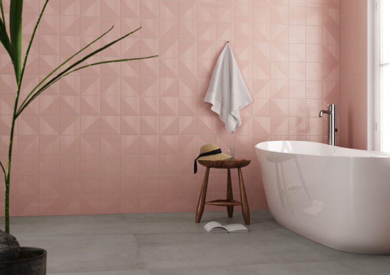
Eros Rosa, brings a soft pink tone that suggests different graphics
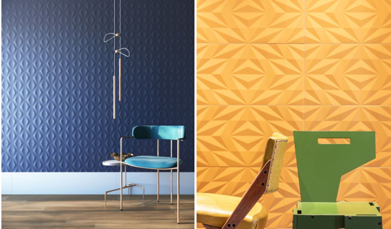
O color block with the use of pastel shades it can also have a more affective footprint and with colors that refer to nature, like blue and yellow, that transmit the welcome of the sky and the sun's rays, and make the house a space for the cultivation of well-being. This is the collection's proposal Boreal, that re-edits the aesthetics of the first coatings produced by Eliane, that remain registered in the memory of Brazilians as reminders of good times lived with the family. In addition to bringing colors and graphics that allow monochromatic pagination, mixed or disruptive, the products still carry this retro legacy.
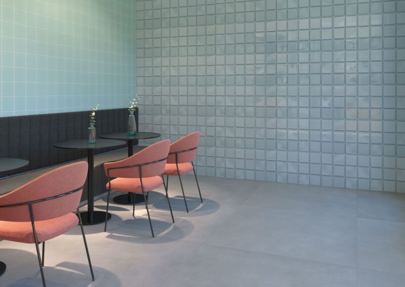
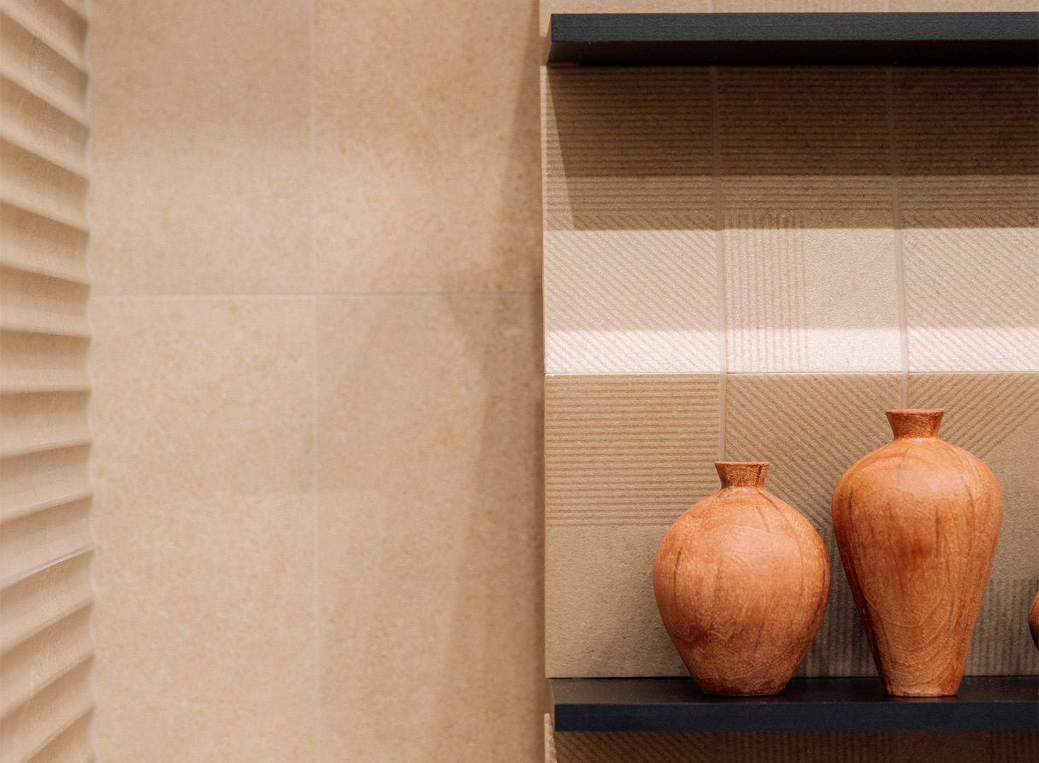
Space with coatings Boreal (to the left)
e Glass (on the right) in blue that conveys tranquility
graphics blocks
The game of composing color blocks can also include lines and graphics to compose contemporary environments full of personality. The modern touch of the collection Brasilia Patch, compose panels full of identity, as signatures for each project. Geometric design contrasts with yellow colors, White, gray and black, valuing complex compositions and straight lines, forming color blocks, inspired by works by artists such as Athos Bulcão (1918-2008), Paulo Werneck (1907-1987) and Antonio Maluf (1926-2005).
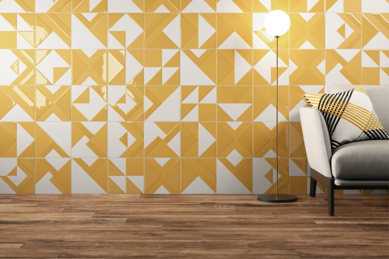
Patch Brasilia Solar forms a contemporary color block
bold and confident
The search for joy and the pleasure of living and being well is a stimulus for increasingly extravagant and bold decisions in the decor. This is reflected in the choice of colors closely linked to each person's personality.. Therefore, lovers of strong colors have lost the fear of using them in exuberant and personalized combinations.
red hive, from the Diamond collection, fulfills this purpose well. The striking relief and the soft, dry touch surface, provided by the satin finish, make up outstanding projects, discreet and elegant.
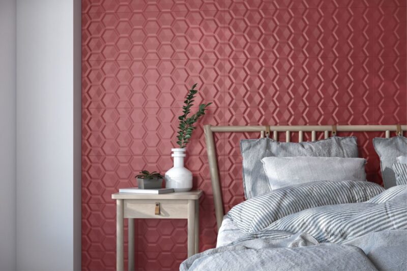
Red Beehive composes a striking and discreet environment when combined with more neutral tones
Each year, coatings evolve and designs emerge that make the products protagonists in the most diverse environments. At this moment, the most difficult thing is to choose the style to be followed for, So, dive into endless possibilities.
 Back
Back